Make an App Icon With Swift UI

It's very easy to create an app icon for your iOS app using Swift UI, but this process is not a native part of Apple development and you will need to use a few tricks to get image assets that can be used for you Xcode project and the App Store.
Why use Swift UI to create your app icon #
As a developer, I have been getting joy from learning Swift UI and trying out a new framework. I have been developing my app, Paraideas, exclusively in Swift UI and I created some nice custom view components that look beautiful on the iPhone. When I started thinking about the app icon I was inspired by the UI I was working on, and I started searching for a way to create an app icon using Swift UI. I was unable to find a concise and complete guide, so I developed this one.
Create a Swift UI view for an app icon #
We want the reference image for our app icon to be a square 1024x1024 pixels. We will first setup our preview to display a surface of an appropriate size for use to draw our app icon.
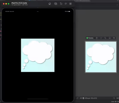
Create a new Swift UI view file to serve as your app icon. I've called mine AppIcon. Since I will be using an iPad Pro (12.9-inch) (5th generation) to render the icon for screenshotting, which is a retina 2x device, I will be using a point size of 512 for my icon size. We will setup a preview to display the Swift UI view at an appropriate size.
import SwiftUI

struct AppIcon: View {
  static let appIconSize: CGFloat = 512

  var body: some View {
    Text("Hello, World!")
  }
}

struct AppIcon_Previews: PreviewProvider {
  static var previews: some View {
    AppIcon()
      .previewLayout(.fixed(width: AppIcon.appIconSize,
                            height: AppIcon.appIconSize))
  }
}
Draw the icon #
Swift UI offers a number of tools for creating interesting icons, including shapes, colour gradients and visual effects like shadows and blur. Using the tools of the Swift UI framework it's possible to create a huge variety of icons. Remember, your code does not have to be performant. This view is not designed to be rendered anywhere in your app, but rather it will be built once during development to create an image asset for your icon.
For this tutorial I will be creating an icon for my app designed to spark creativity. Since this is an app about inspriring thoughts, I will make the icon a cartoon-style thought bubble.
I started with a ZStack so I can have elements placed on top of each other, and I set the frame to be the size of the app icon. The background is a gradient that forms a "sky" and the thought bubble is created using Swift UI Circles stacked on top of each other. I created this in less than half an hour, and I'm sure with more creativity and time you will create some amazing app icons.
import SwiftUI

struct AppIcon: View {
    static let appIconSize: CGFloat = 512

    private let cloudBubbleSize: CGFloat = 60

    var body: some View {
        ZStack {
            // Sky blue background
            LinearGradient(colors: [Color("LightSky"),
                                    Color("SkyBlue")],
                           startPoint: .topTrailing,
                           endPoint: .bottomLeading)

            // Leading bubbles
            Circle()
                .path(in: CGRect(origin: CGPoint(x: 20,
                                                 y: AppIcon.appIconSize - cloudBubbleSize - 20),
                                 size: CGSize(width: cloudBubbleSize * 0.5,
                                              height: cloudBubbleSize * 0.5)))
                .fill(Color("White"))
                .shadow(color: Color.black.opacity(0.4), radius: 5, x: 5, y: 5)
            Circle()
                .path(in: CGRect(origin: CGPoint(x: 30,
                                                 y: AppIcon.appIconSize - cloudBubbleSize - 70),
                                 size: CGSize(width: cloudBubbleSize * 0.7,
                                              height: cloudBubbleSize * 0.7)))
                .fill(Color("White"))
                .shadow(color: Color.black.opacity(0.4), radius: 5, x: 5, y: 5)
            Circle()
                .path(in: CGRect(origin: CGPoint(x: 50, y: AppIcon.appIconSize - cloudBubbleSize - 140),
                                 size: CGSize(width: cloudBubbleSize,
                                              height: cloudBubbleSize)))
                .fill(Color("White"))
                .shadow(color: Color.black.opacity(0.4), radius: 5, x: 5, y: 5)

            // Cloud bubbles
            ZStack {
                Circle()
                    .path(in: CGRect(origin: CGPoint(x: 200, y: 200),
                                     size: CGSize(width: cloudBubbleSize * 3,
                                                  height: cloudBubbleSize * 3)))
                    .fill(Color("White"))
                Circle()
                    .path(in: CGRect(origin: CGPoint(x: 100, y: 180),
                                     size: CGSize(width: cloudBubbleSize * 2.8,
                                                  height: cloudBubbleSize * 2.8)))
                    .fill(Color("White"))
                Circle()
                    .path(in: CGRect(origin: CGPoint(x: 20, y: 100),
                                     size: CGSize(width: cloudBubbleSize * 2.5,
                                                  height: cloudBubbleSize * 2.5)))
                    .fill(Color("White"))
                Circle()
                    .path(in: CGRect(origin: CGPoint(x: 100, y: 30),
                                     size: CGSize(width: cloudBubbleSize * 3.5,
                                                  height: cloudBubbleSize * 3.5)))
                    .fill(Color("White"))
                Circle()
                    .path(in: CGRect(origin: CGPoint(x: 330, y: 180),
                                     size: CGSize(width: cloudBubbleSize * 2.2,
                                                  height: cloudBubbleSize * 2.2)))
                    .fill(Color("White"))
                Circle()
                    .path(in: CGRect(origin: CGPoint(x: 250, y: 50),
                                     size: CGSize(width: cloudBubbleSize * 2.8,
                                                  height: cloudBubbleSize * 2.8)))
                    .fill(Color("White"))
                Circle()
                    .path(in: CGRect(origin: CGPoint(x: 360, y: 90),
                                     size: CGSize(width: cloudBubbleSize * 2,
                                                  height: cloudBubbleSize * 2)))
                    .fill(Color("White"))
            }
            .compositingGroup()
            .shadow(color: Color.black.opacity(0.4), radius: 5, x: 5, y: 5)
        }.frame(width: AppIcon.appIconSize, height: AppIcon.appIconSize)
    }
}

struct AppIcon_Previews: PreviewProvider {
    static var previews: some View {
        AppIcon()
            .previewLayout(.fixed(width: AppIcon.appIconSize,
                                  height: AppIcon.appIconSize))
    }
}
Create the reference icon image #
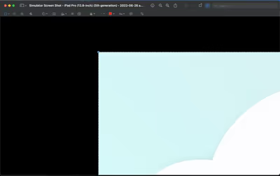
Now that we have our icon designed in Swift UI, we need to create an image asset which can be sized appropriately for our icons. At the time of writing, running a live preview in Xcode will not provide a surface with the fixed width and height layout we have set, so we will need to run this on an iPad simulator.
Modify your Swift UI app to simply display only your app icon and run your app on the iPad Pro simulator. I am running on an iPad so I have a display big enough to fit the entire app icon on the screen. Once the app is running and you can see your app icon displayed on the screen, take a screenshot of the simulator.
Open the screenshot in Preview, toggle edit mode and use the rectangle select to draw a rectangle over your app icon. You can zoom in to a very high value in preview to line up the rectangle with the corners of your app icon. The rectangle select should display a value of 1024x1024 when selected. Now you can use the "Crop to Selection" command to trim the images to exactly 1024x1024 pixels and save the image. Congratulations! You have the reference image for your app icon.
Resize the reference image to required icon sizes #
Once you have your 1024*1024 image, you can down resize it down to all the various sizes you will need for Xcode and the App Store. For me, I was lazy so I used this App Icon Generator which I found by doing a search for "app icon generator". You can easily resize the image yourself in Photoshop, Sketch, Gimp and many other programs.
To create an Android app icon you can simply use the image asset creation tool in Android Studio, select your image and let the masks apply to the reference. When designing for Android though you may want to create a foreground layer and background layer. This is out of the scope of this guide.
Add your new app icon to your Xcode project #
Your done! You have your app icon image set, so you can drag it into your xcassets in Xcode to add your icon to your project. Don't forget to undo the change you made to your Swift UI app so your app icon is not displayed. You can save the app icon Swift UI file in your project so you can modify or reuse it in the future.
Creating a Swift UI app icon is a great option for someone who is a developer first and graphic designer second, or someone with limited experience with graphic design software. My hope is that someday soon Apple will provide greater support for creating app icons in Swift UI, and maybe make it a native feature of the platform.